Open to senior product roleshello@saribrooke.com

My Pod Planner

SoloAI‑Assisted BuildIndie ProductIn Beta

A light-zone-aware planning tool for owners of Gardyn indoor hydroponic gardens, designed and shipped with AI as the implementation partner. Live at mypodplanner.com.

mypodplanner.comOpen in new tab ↗
TL;DR

A solo indie product I designed and shipped in two weeks, with AI as the implementation partner. Launched April 2026; the 4–6 week return cadence I built the case study around validated within three weeks. A week‑one deployment incident exposed where AI‑assisted work needs hard production guardrails, which now drive my working pattern.

Overview
Role
Solo Product Designer & Builder
Scope
Product strategy, UX, interaction design, AI‑assisted implementation
Stack
Claude (AI implementation partner), Supabase, Vercel, PostHog
Timeline
Two weeks to initial launch
Status
Live beta product

Gardyn owners had been manually planning pod layouts in charts and spreadsheets since the product's inception. The issue wasn’t missing information. It was missing spatial intelligence.

I designed and shipped My Pod Planner, a light‑zone‑aware planning tool that helps Gardyn owners decide what to plant, where to place it, and what to replant next.

The product launched publicly in April 2026 and quickly developed a highly engaged early user base, with users returning for long planning sessions and contributing feature ideas within days of launch.

The product remains in active beta while I explore premium planning and custom‑plant functionality.

The Problem

For four years, Gardyn owners had been planning pod layouts in a community‑maintained spreadsheet. Every 4–6 weeks, when their pods exhausted, they returned to it. Users kept asking the subreddit for a proper app, but the real issue wasn’t access to information.

It was interaction design.

Gardyn’s ecosystem provided:

  • a catalog of plants
  • a generic light map
  • and scattered documentation
Gardyn's published light zone diagram showing three intensity zones on the Gardyn Home unit: high-intensity in the center cluster, medium around the periphery, and low along the bottom and top rows.
Fig 1 · Gardyn Home light zones. Image: Gardyn.
A Gardyn seed card for Purple Cayenne Pepper showing a plant photo, description, and a Care & Harvest list. The Light Zone: High row sits fifth in the list, highlighted in amber.
Fig 2 · Cayenne pepper card. Light Zone listed fifth in the Care & Harvest section. Image: Gardyn.
A Gardyn seed card for Dill from the same catalog, with a different visual layout than the cayenne pepper card. The light requirement is highlighted in amber.
Fig 3 · Dill card from the same catalog, formatted differently. Image: Gardyn.

Users still had to mentally translate that information into a physical layout. The spreadsheet they’d been using for four years couldn’t model:

  • spatial relationships
  • light‑zone behavior
  • stagger timing
  • or real planning workflows

The problem was fundamentally visual.

Process & Research
01 / Pre‑launch: Behavioral archive mining

I treated the existing Gardyn community on Reddit and Facebook as a large‑scale behavioral research archive.

Instead of formal interviews, I analyzed years of:

  • Reddit discussions
  • Facebook conversations
  • workaround spreadsheets
  • planting frustrations
  • and recurring failure points
A Reddit screenshot of an r/Gardyn post titled 'Replacing Pods in Gardyn' that asks whether pod placement still matters when replacing pods as they die off, or whether owners can put any plant anywhere.
Fig 4 · A pod‑placement question on r/Gardyn.

I focused on:

  • where users abandoned planning
  • how they described the frustration
  • and what behaviors repeated across experience levels
02 / Post‑launch: Session recordings and direct feedback

After launch, feedback from the Reddit community and session recordings became the primary research tool.

Within 48 hours, I had enough real usage behavior and feature requests to begin iterating meaningfully.

Several patterns emerged quickly:

  • One user spent more than 90 minutes planning across two sessions
  • Another generated 673 clicks and 192 keystrokes in a single hour
  • Multiple users named their maps, which emerged as a strong ownership signal
What users got stuck on
Colored category tag pills (Fruiting Plants, Vegetables, Due soon, Existing) shown below the planner map. Users clicked these expecting filtering, but they were non-interactive.
Fig 5 · Map tags, clicked but unresponsive.
The email confirmation step shown after sign-up, with a dark green Create account button and a note about checking spam.
Fig 6 · Email confirmation, the exit wall.
The empty wizard map shown at the start of the planning flow, with dashed empty cells under a LEFT column header.
Fig 7 · Empty wizard map, 1h+ to fill.

Three features shipped within hours of discovery, in response to observed behavior:

  • Made the tags beneath the map clickable after noticing users click them and get nothing.
  • Removed the email confirmation step after noticing a user abandon the site at that wall.
  • Replaced the wizard’s empty map with a searchable plant list after noticing even the most dedicated users took more than an hour to fill it in, clicking into each field to search for one plant at a time.
Design Decisions

I designed and shipped five primary workflows:

The Maps view in My Pod Planner, showing a three-column grid of pod slots labeled LEFT, CENTER, and RIGHT, with plant names and icons in each slot color-coded by light zone preference. Above the grid are a 'Find best spot' search input and Refill, Clear, and Undo controls.
Fig 8 · The Maps. Pods color‑coded by light zone, with drag‑to‑swap, search‑to‑plant, and persistent state.
01 / The Wizard

A structured onboarding flow that helps users configure their Gardyn unit without requiring horticulture expertise.

02 / The Maps

One 3x10 and another 2x15 light‑zone‑aware layout with drag‑to‑swap, search‑to‑place, visual light intensity mapping, and persistent state.

03 / The Pod Shed

A persistent inventory system for pods users already owned.

04 / Replace‑a‑Pod

A lightweight no‑signup planning flow designed to reduce commitment friction.

05 / The Harvest Flow

Instead of a single “remove plant” action, the system introduced two distinct outcomes: Pick a few leaves or Harvest the whole plant. If it’s not ready, users can choose to snooze it 3 days, 1 week, or 2 weeks.

Principle

Warn, don’t block.

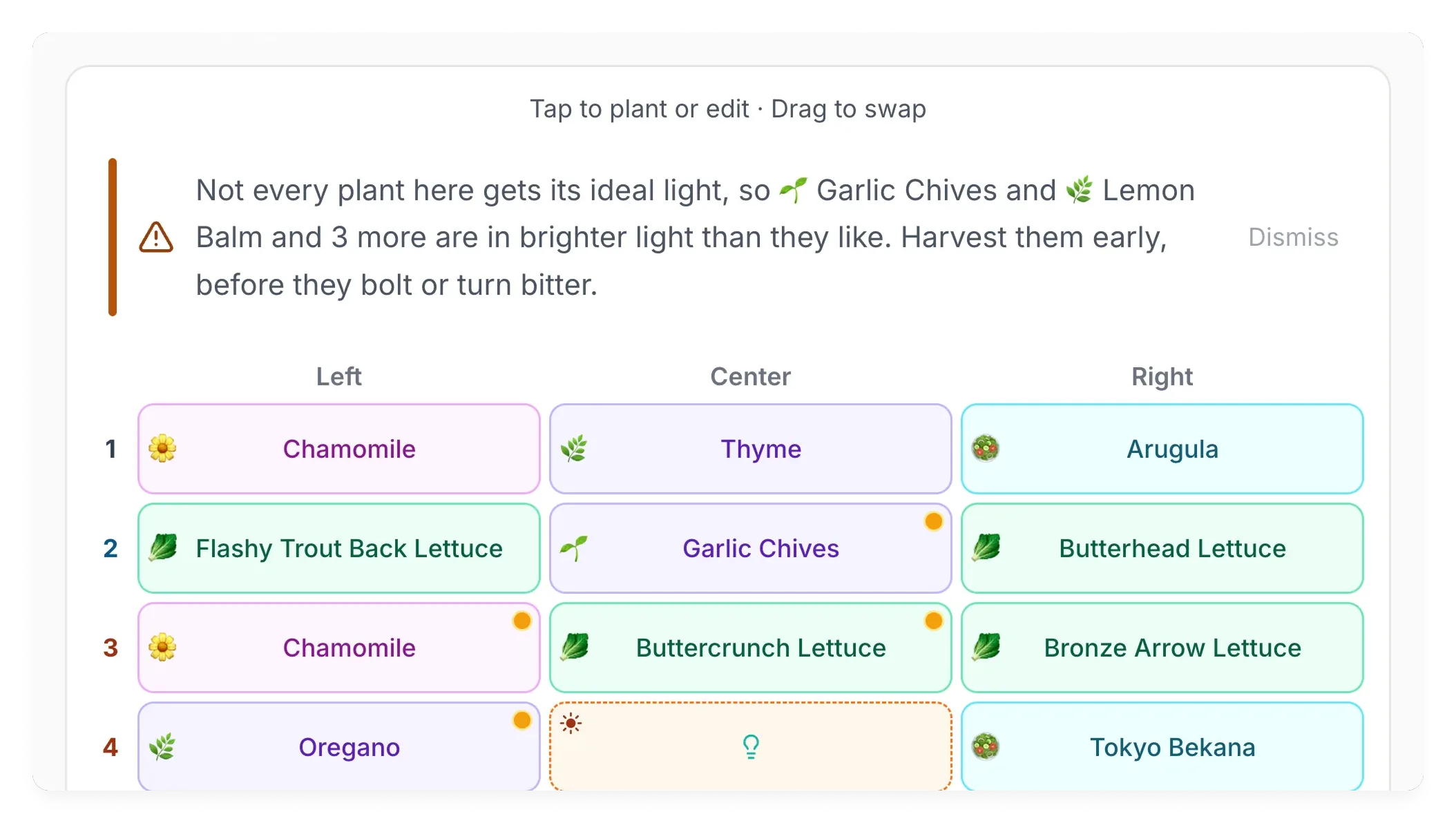
My first instinct was to block “bad” placements outright. The system would refuse to let a high‑light plant go in a low‑light slot. Reading the Reddit threads is what changed my mind: Gardyn owners often end up with more plants of one light level than they have slots for that level. Blocking them in that case forces a user to either put a plant somewhere they don’t want it or, more likely, close the tab and not come back. I redesigned the flow to flag the consequence inline (e.g. Sweet Thai Basil in a low‑light slot, prefers mid) and let the user decide.

Pattern that carried across the product

Once “warn, don’t block” landed in the placement flow, the same stance carried into three other parts of the product:

  • Auto‑place recommendations. The system suggests a layout but doesn’t enforce it. Users drag plants between zones to compare, which is what they were doing anyway.
  • Tip persistence. Layout banners stay until the user dismisses them, instead of disappearing on the next unrelated edit and leaving the original issue unresolved.
  • Mid‑light bolting validation. Plants that bolt under high‑intensity LEDs (basil, cilantro) are flagged inline with a tap‑to‑detail explanation, not blocked. The same callout pattern as the placement warning.

Three separate decisions, one underlying stance: trust the user with information, give them control, and don’t second‑guess explicit choices.

The My Pod Planner Maps view showing a Tips for this layout callout: 'Heads up: 1 pod in less light than it prefers. 1 Sweet Thai Basil in low-light (prefers mid). It may grow slower or produce smaller yields.' Below the callout, the three-column planner grid shows the layout with Sweet Thai Basil in a low-light slot at row 1 LEFT, marked with an orange dot indicating the mismatch.
Fig 9 · The placement warning, in place of a blocking modal.
What I deliberately didn’t ship

AI pod identification.

An early idea of mine: a flow where users could photograph their existing pods and have AI add them to the Pod Shed automatically. As I scoped it with Claude, two concerns came up. The only secure implementation pattern would have required each user to provide their own image‑recognition API key, which pushed the planner toward a more technical audience than it was meant to serve. The recurring per‑user inference cost would also have made the free tier hard to keep free. I decided not to ship it.

Launch & Operational Learnings

Shortly after launch, a deployment accidentally broke both PostHog analytics and Supabase persistence.

The issue wiped several early users’ saved layouts and cost the first two days of launch analytics.

I identified affected users manually and communicated with them directly.

The experience fundamentally changed how I approach AI‑assisted implementation and production safeguards.

Three-step diagram of the pre-deploy review flow. Step 1, Code change: implementation lands locally. Step 2, Claude reviews: four parallel checks, with migration safety and production edge cases shown as passing (green) and persistence flows and analytics integrity shown as flagged (red) — the two areas the launch incident touched. Step 3, Deploy: released to production.
Fig 10 · Pre-deploy review flow added after the launch incident.

Going forward, I would introduce a mandatory pre‑deploy review layer where Claude reviews:

  • migration safety
  • persistence‑sensitive flows
  • analytics integrity
  • and production‑risk edge cases separately from happy‑path behavior

AI accelerated implementation dramatically.

But production accountability still belonged to me.

My working pattern after the incident: AI handles implementation, routine refactors, and feature‑pace work. I treat anything that touches user data, migrations, or analytics as a manual review boundary. Before a change to those areas ships, I walk migration safety, persistence flows, and analytics integrity as separate review passes rather than bundling them with feature work. The separation keeps velocity high on the parts where AI is reliable, and slows me down on the parts where I need to be the one accountable.

Outcomes & Learnings

Three open questions going into launch: was the 4–6 week planting trigger I built the case study around real, would the community adopt an indie tool, and could AI‑assisted implementation hold quality at launch velocity. Here’s what landed.

4–6 week return cadence
Validated. Two first‑week cohort users returned independently inside the predicted window, without reactivation outreach. A third user has since demonstrated a recurring weekly‑ish rhythm across two return intervals on his own schedule.
Community adoption
Validated. Referenced alongside Gardyn’s own documentation in Reddit discussions. Indexed visually by Google AI Overview.
AI‑assisted production quality
Not validated at launch. A deployment incident wiped early users’ saved layouts. Pre‑deploy review flow added in response.
Sustained engagement
51 signups in five weeks against roughly 100K Gardyn units worldwide, with no marketing spend beyond one Reddit launch post. Named users return for both deep planning sessions (60+ minutes) and quick reference visits (under 5 minutes), the dual usage pattern the product was designed to support.
Reddit thread: a user thanks me for the planner's in-app warnings about experienced-grower-only plants. My reply notes the warnings came from being a Gardyn owner myself.
Fig 11 · A user catches the difficulty warnings built into the placement flow.

The 4 to 6 week planting trigger that opens the case study was a pre‑launch hypothesis. Three weeks after launch, two users from the first‑week signup cohort came back inside that window, independent of each other and without reactivation outreach. Both had been silent since their first session. A third user has since logged two return visits seven and ten days apart, suggesting the trigger moment isn’t only monthly: some users return on a weekly rhythm as well.

A weekend in week 4‑5 stacked further evidence. The site crossed 50 users on Friday. Over the next two days I logged two deep‑engagement sessions from visitors who didn’t sign up, at 11 and 40 minutes respectively, both well above the typical web session. Both confirmed the freemium logic: transient use stays free, only saved state asks for a signup, and the users who do convert are self‑selecting as the segment that wants persistence. A first confirmed non‑signup return visit landed shortly after.

The build itself moved unevenly. Implementation accelerated with AI faster than I’d expected, but prioritization, systems thinking, and production safeguards didn’t. The post‑launch outage made that gap visible.

Open to senior product roles, especially ones where shipping fast and owning the production layer matter together. hello@saribrooke.com.

Continue
02 · Edtech · By request
Edtech case study
03 · Enterprise SaaS · By request
Enterprise SaaS case study
04 · Enterprise SaaSComing soon
Role-Based Access Control
Case study in progress